Primary and secondary colours
I learnt from the previous exercise that the strength of a colour can be altered by changing the exposure settings. This exercise explores this further using the primary and secondary colors.
On a colour wheel, based on the painters’ primaries: red, yellow and blue sit opposite their complementary colours. Red sits opposite green, yellow opposite violet and blue is across from orange. The secondary colours, green, yellow and violet, are created from combinations of the 2 primary colours which sit on either side of the secondary colour on the colour wheel.
Blue + Yellow = Green.
Red + Yellow = Orange.
Blue + Red = Violet

I have taken my time over this exercise and taken many ‘colourful’ photographs on my visits to a marina, a market and a local park. I have opted to use this park photographs in this blog entry as these illustrate most of the colours in a natural way.
I set my camera to Manual mode as this setting allows me to use the in-camera exposure meter to gauge exposure. The ISO was set to 100 while the WB was set to sunny. All images are RAW format and are unprocessed.
Primary Colours
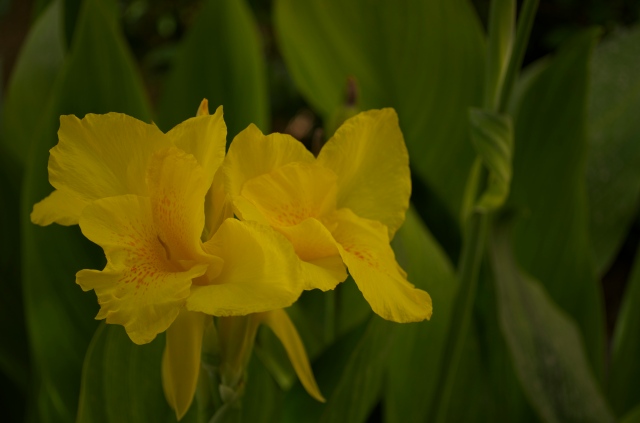
RED
Freeman (2005, p32) describes red as being one of the most insistent and powerful colours. It immediately attracts attention and has many strong associations such as danger, heat and passion.
The red of this Canna Lily really stood out against the green and dark foliage in the background. Freeman notes that when red is seen against cooler colours, such as blue and green, it can be perceived to have a 3D effect and advance towards the viewer.
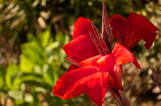
1. 52mm, f/5.6, 1/250s, ISO 100
At a focal length of 52mm the in-camera meter suggested a shutter speed of 1/250s while the aperture was wide open at f/5.6, to ensure a narrow depth of field. As the light was hitting one side of the lily it has produced interesting variations in the reds between the highlighted areas and the shadows.

2. 52mm, f/5.6, 1/180s, ISO 100
As I wanted to retain a shallow depth of field throughout these shots, I have adjusted the shutter speed to change the exposure, in this case making it 1/2 stop brighter. As a result the highlighted areas have increased and the surface reflections have diluted the colour. The background has also brightened making it more dominant and distracting.
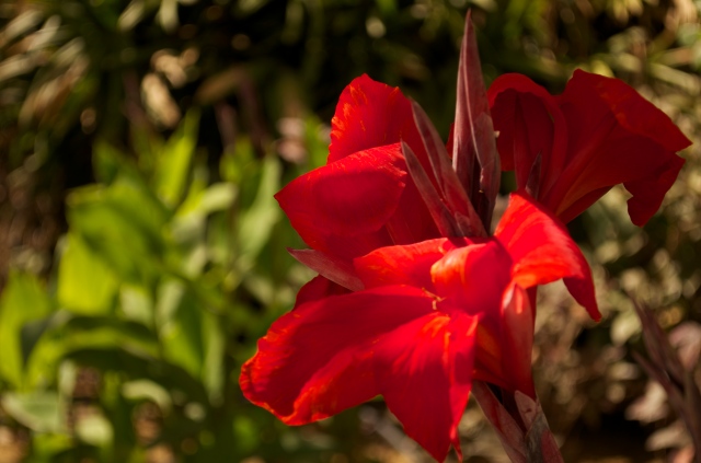
3. 52mm, f/5.6, 1/350s, ISO 100
I adjusted the shutter speed to 1/350s to under-expose the image by 1/2 stop. Of the three exposures I think this produces the best outcome. The highlighted areas are softer and the details in the petals become more visible.
As the brightness of the red is so varied in each photograph it’s hard to say which exposure best matches the red from the colour wheel and with hindsight I should probably have chosen a subject that was evenly lit.
Instead, I have selected another red flower photograph from my catalogue. I shot this several weeks ago and at the time of shooting did not experiment with different exposure setting; therefore in order to complete this exercise I have adjusted the exposure in post- processing.

55mm, f/5.6, 1/1250s, ISO 100
The red here is similar to the colour wheel but quite dark on some petals.

+1/2 stop
At 1/2 stop over exposed the red is very bright and appears slightly pink on the 2 right hand side petals.

-1/2 stop
Although, under-exposing by 1/2 stop has darken the stem, flower buds and background it has strengthened the red on the petals. I think this appears the closest match to the red on the colour wheel.
YELLOW
Yellow is the lightest and brightest of all colors. It doesn’t exist in a dark form and its brilliance is its most noticeable characteristic. It is often used to attract attention as in road signs or in the hundreds of bright yellow school buses that drive Dubai’s roads each day. Freeman (2005, p36) notes that expressively, yellow is vigorously and very sharp with associations with the sun, light and cheerfulness.
Using manual mode, the meter suggested a shutter speed of 1/250s with a focal length of 44mm and an aperture of f/5.3.
- 1. 44mm, f/5.3, 1/250s, ISO 100
Freeman (2004, p36) notes that there is very little latitude with yellow, it very quickly moves towards green in one direction and orange in the other. The colour patches he shows (p37) notes only 8 different shades of yellow, which is quite a narrow spectrum compared to the 20 colour patches shown for red. A range of yellow can be seen here with the yellow of the lily petals varying from yellow, to lemon and then towards a yellow-green, a colour cast from the surrounding leaves. In the center of the flower head the colour is a yellow-orange shade. . Overall, the yellows don’t seem bright enough to match the yellow on the colour wheel.

2. 44mm, f/5.3, 1/180s, ISO 100
At a 1/2 stop brighter the green and orange tones seem less obvious and the yellow’s brilliance has increased.

3. 44mm, f/5.3, 1/350s, ISO 100
At 1/2 a stop under-exposed the yellow appears much less bright.Out of interest, I looked at the HSB figures for this yellow in Photoshop and noted that the levels of brilliance ranged from 38-65% while in the 1/2 stop over exposed photograph they were much higher at 64-84%.
As it is brighter with less evidence of green, the 2nd photograph appears to be the closest match to the yellow on the colour wheel.
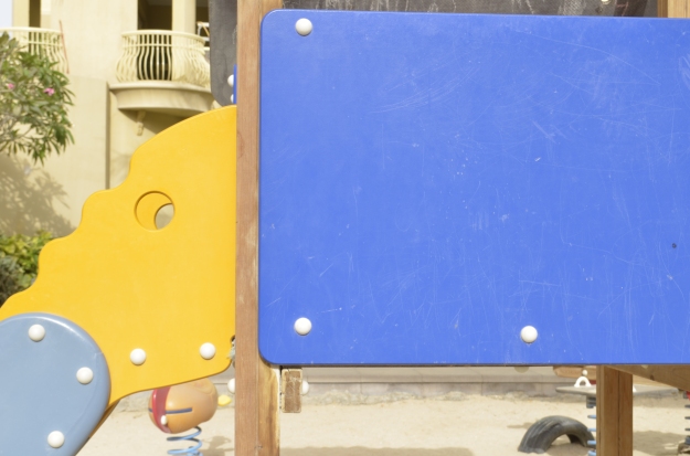
BLUE
Freeman (2005, p40) describes blue as being a quiet and cool colour that suggests passivity and also a reflective mood. It has considerable latitude and has its greatest strength when deep.
While there may be blue skies above me and blue waters around me, I found it hard to find a subject close to the pure blue shown on the colour wheel, particularly in a natural source. I eventually selected a man-made source of blue after spotting this blue on a section of a children’s slide at the local park.
At a focal length of 40mm and an aperture of f/11 the in-camera meter suggested a shutter speed of 1/125s

40mm, f/11, 1/125s, ISO 100
Although this is a strong blue it is not as dark as the blue on the colour wheel.
40mm, f/11, 1/60s, ISO 100
Adjusting the shutter speed to exposed 1/2 stop brighter produces a much lighter blue. It has also altered the ‘elephant head’ section of the slide from yellow/orange to a much brighter yellow. The lighter tone shows the ‘wear and tear’ on the blue section which is less noticeable in the other 2 exposures.

40mm, f/11, 1/180s, ISO 100
Under-exposure by 1/2 a stop produces a blue which is the closest match to the blue on the colour wheel, although darkening it a little more would possibly be an even better match.
Secondary colors
GREEN
Freeman (2005, p44) notes that as green is the main colour of nature, it has mostly positive associations and symbolism, such as growth and youth.
Green is the most visible of colours to the human eye in low light, despite it being of medium brightness. It is positioned between yellow and blue on the colour wheel and as result can take on many forms including yellow-green and turquoises. Pure green, however, is not common in nature as I found while looking for subjects for this exercise.
I decided to take this photograph of these 3 layers of large, fern-like leaves one behind the other.
The in-camera meter suggested a shutter speed of 1/250s when the aperture was f/5.3 and the focal length, 48mm.

1. 48mm, f/5.3, 1/250, ISO 100
I like this image as it illustrates a range of green tones. There are small sections in the middle leaf of the layer that are close to the pure green of the colour wheel, however the majority of tones are either too light or too dark.

2. 48mm, f/5.3, 1/180s, ISO 100
Decreasing the shutter speed to 1/180s has lightened the greens throughout. Again, sections of the middle leaf are the closest match to pure green.

3. 48mm, f/5.3, 1/350, ISO 100
An increase of 1/2 stop shutter speed has darkened the greens, particularly in the foreground. However a close-up screen shot of the middle leaf notes that some of the greens here (running from top left, diagonally towards the bottom right) are close to the pure green on the colour wheel.
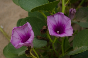
VIOLET
Violet has associations with being rich and sumptuous and can create a sense of mystery. It is linked to royalty, religion and superstition.
Freeman (2005, p48) notes that many people have difficult in distinguishing pure violet and states that this is magnified by the fact that colour monitors and ink are often unsuccessful with this colour.
Before beginning this chapter I too was somewhat confused as to the difference between violet and purple, having previously just used the label ‘purple’ to describe them both. However, I now seem to be gaining some appreciation as to their differences. I am beginning to look for violet and consider whether is it pale or dark? Is it more blue or red? The colour patches printed, and labelled, in Freeman (2005) have been a useful reference guide as I develop my colour discrimination skills.

For example, this shot initially seemed violet to me, but now I can clearly see that it is pink, possibly somewhere between a deep pink and a hot pink.
This flower appears (to me) like purple with lighter elements of a medium orchid colour.
As can be seen from the examples above, I did not find it easy to find a pure violet colour to photograph.
I considered these flowers (petunias, I think?), pictured below, to be the closest match. The in-camera meter recommended a shutter speed of 1/125s, for an aperture of f/5.6 and focal length of 55mm.

1. 55mm, f/5.6, 1/125s, ISO 100
At the recommended exposure the violet colour of the front petunia in this shot is a very close match to the violet of the colour wheel. The texture, shape, construction of the flower and the available light also make other shades visible too. The darker centre area of the flower is leaning towards blue-violet and a few spots around the edge of the petals appear slightly pink.

2. 55mm, f/5.6, 1/90s, ISO 100
At 1/2 stop over-exposed the colour of the front petunia is much lighter, more of a pale violet red. The flower in the background however is now closer to a match for the violet of the colour wheel.

3. 55mm, f/5.6, 1/180s, ISO 100
At 1/2 stop under-exposed the front petunia appears to be a dark orchid shade while the flower in the background now looks blue-violet.
I think overall, the first photograph is the closest match to pure violet.
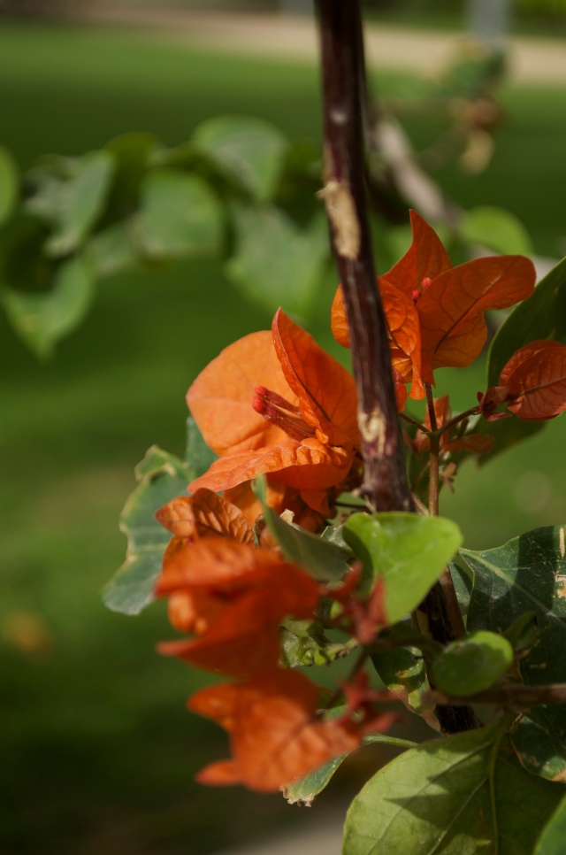
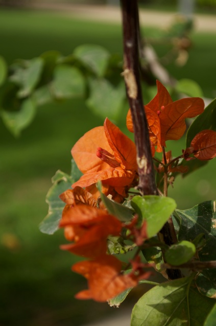
ORANGE
According to Freeman (2005, p50), orange absorbs some of the qualities from its two source colours, red and yellow. It radiates the energy from red and the light from yellow and symbolically it is interchangeable with yellow from the sun and red for the heat. It has associations with festivity, celebration, heat and dryness.
I choose this orange Bougainvillea flower to illustrate orange.

1. 52mm, f/5.6, 1/500s, ISO 100
At the exposure recommended by my in-camera meter the orange is not a pure orange, but more of a dark red/orange colour. The petal and flower centre that are the point of focus, appear lighter as they are receiving direct sunlight. However they are still not light enough to be a good match to the orange on the colour wheel.
2. 52mm, f/5.6, 1/350s, ISO 100
At 1/2 stop over exposed the orange Bougainvillea flower has brightened and is a fairly good representation of pure orange.
According to http://www.rapidtables.com/web/color/RGB_Color.htm the RGB code for orange reads R-255, G-165, B-0. Using Photoshop, I decided to check the RGB code for the orange (at the focal point) in image 2 and was surprised to see it contained quite a lot of blue, reading R-231, G- 132, B- 61.

3. 52mm, f/5.6, 1/750s, ISO 100
1/2 of a stop under-exposed results in the flowers all having a distinct deep red colouring.
I was left wondering about the RGB levels of the orange in image 2. I decided to examine a few other ‘orange’ photographs that I had taken to see if any were a closer match to pure orange.
After several attempts, I noted that the orange in this photograph, taken 1/2 stop below the in-camera’s recommendation, contains no blue.

55mm, f/5.6, 1/350s, ISO 100
The RBG levels for this orange in the main cluster of flowers is R-225, G-101, B-0, which is closer to the 255, 165, 0 code of pure orange than the previous set of photographs. I think visually the orange in this image appears brighter with less evidence of red.
Conclusions
I have taken quite a long time over this exercise as I wanted to really understand and recognise the colours discussed. I do find now that I am looking at a subject’s colour and mentally analysing its qualities.
This exercise has forced me out of my usual shooting mode, aperture priority, into manual mode, which I have found, overall, far less scary than I had anticipated. This is something I plan to spend more time exploring.
It was harder to find pure colours in the natural world than I anticipated. I have realised that they are generally much brighter than I would have initially thought, however this has added to my understanding of ‘brightness or brilliance’.
On a practical level this exercise has shown me that when taking a series of photographs I tend to move the camera slightly between shots. As this can potentially affect focal point and exposure, I know I need to take my time and use visually markers to make the framing more constant.
I am also more aware of how much a colour can be altered by very slight adjustments, in this exercise 1/2 stop, in exposure. The results were varied. For example the blue was truest when under-exposed, the yellow when over-exposed and the violet at the recommended exposure settings. This tells me that each colour has its own properties, as does each subjects and these factors, teamed with particular lighting conditions means each shot benefits from an individual approach.
M. Freeman (2005) Digital Photography Expert: Colour. Lewes: ILEX
Open College of the Arts. Basic Colour Theory. Barnsley: Open College of the Arts