Category Archives: 06. Dividing the Frame

Positioning the horizon

View a scene through the camera viewfinder and consider the different positions in which you could arrange the horizon line in the frame.

This exercise required me to consider the ways in which the horizon could be used to divide the frame and to note the effect this may have on the photograph and the viewer.

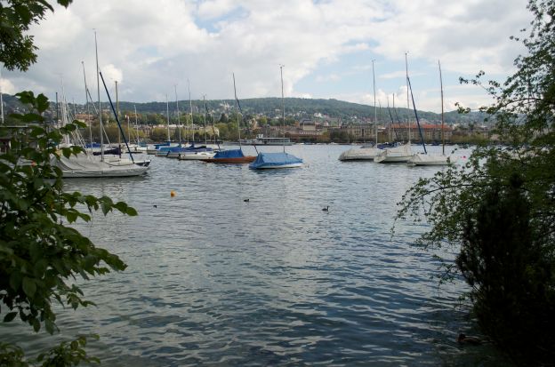
Using my wide-angle lens, I took a short series of photographs looking across Lake Zürich. As it conformed comfortably to the landscape view I composed the photographs in a horizontal frame using far side of the lake as the horizon line.

For the first photograph I decided to place the horizon low in the frame.

Lake Zürich 1. 24mm, F5.6, 1/800s, ISO 100

This image shows rows of boats moored upon the lake. However, I found that my eye was quickly drawn up towards the cloud formations in the sky, which dominate 2/3 of the photograph.  The horizontal frame and low horizon both give a sense of stability to the image.

This viewpoint also included foliage which offers a frame to the image on 3 sides. At the time I composed this shot I felt as though this frame helped add depth to the image. I since, however, have read Präkel’s text on Composition which notes that while framing with overhanging tree branches is popular in landscape photography its execution is often not successful. He suggests that rather than have isolated branches hang into the frame it is better to show the tree trunk to which the branch is attached to one side of the frame with the overhanging branches to the top. This is something I could have tried here had I adjusted my position slightly.

Lake Zürich 2. 24mm, F/5.6, ISO 100, 1/640s

The second photograph of the series shows the horizon line placed at approximately the mid-point of the image, dividing the frame into 2 distinct areas. This viewpoint gives equal importance to the lake and boats and to the sky. With the horizon placed at this point a large section of blue sky, which I felt added interest to the first image, is lost. This composition did not encourage me to ‘look’ at the whole photograph but merely to concentrate on the horizon details. The overall impression of this image could be considered to be safe and conventional.

Lake Zürich 3. 24mm, F/5.6, ISO 100, 1/640s

In the third photograph the horizon line is placed higher in the frame giving priority to the foreground; the lake. This encouraged me to look across the lake from left and right and then also to look up and down, noticing the ripples on the water suggesting a little movement.  The sky area is smaller now and offers little graphic interest.

Lake Zürich 4. 24mm, F5.6, 1/500s, ISO 100

In the fourth photograph the horizon is placed very high in the frame which adds more depth to the image. Again, I feel as though the eye is encouraged here to look both left to right and up and down within the image. The lake, in the foreground, has little detail to hold a viewer’s interest. The sky appears gray and unremarkable but this did encourage me to look a little longer at the hills and buildings in the distance, possibly in a search for colour or form.

While these four images were taken from the same viewpoint,  moving the horizon has changed the overall effect. I believe the strongest image is the Lake Zürich 1, despite the overhanging branch. This view shows the lake, while giving priority to the sky encouraging the viewer to look across the lake and up to the sky. The viewpoint didn’t have enough interest in the foreground to merit a high-placed horizon.

One practical problem I noticed during this exercise is my tendency to tilt the camera when taking photographs, which resulted in images of horizon lines on a slight diagonal. When discussing line in his Composition text, Präkel emphasises the need for careful alignment of the horizon line in order to create a stable image. He notes that some photographers use a bubble level to remedy this.

Dividing the Frame- Balance

From my already-taken photographs, choose a small selection and decide how the balance works in each.

At the heart of composition lies the concept of balance. Balance is when opposing forces are equalised, providing equilibrium and a sense of harmony.

In photography, balance can refer to any of the graphic elements in a photograph such as objects, points, lines, colours and backgrounds, and the way they are arranged so to find the visual “centre of gravity.”

Freeman defines two distinct types of balance; symmetrical and dynamic. Symmetrical balance is when the arrangement of forces is centred. Using a weighing scale analogy, this static balance can be illustrated by showing an object, or objects, sitting over the fulcrum, the point of balance, as below.

Screen Shot 2012-07-29 at 18.44.53

Dynamic balance concerns opposing and unequal weights and forces. Returning to the weighing scale, this could be demonstrated by a large object balanced by a small object, provided the smaller object is placed far enough away from the fulcrum.

Dynamic balance concerns opposing and unequal weights and forces. Returning to the weighing scale, this could be demonstrated by a large object balanced by a small object, provided the smaller object is placed far enough away from the fulcrum.

I will now decide how the balance works in a selection of my own photographs, and use the ‘weighing scale’ to illustrate this.

This image has the tower positioned centrally over the weighing scale’s fulcrum. This provides a simple example of symmetrical, or static, balance.


1. The Address Hotel, Dubai

This photograph also has symmetrical balance, with the seagull positioned in the middle of the shot. Here, the prominent colours also offer balance as the orange/yellow hues complement the blues.

2. Seagull on buoy.


Maximum symmetry occurs when an object or lines radiate around the frame’s centre giving symmetry on all axes, as is the case with the sunflower image below.

3. Sunflower

This photograph also demonstrates maximum symmetry as the lines of the petals extend around the centre. The pink of the petals is also balanced by the complementary green tones of the background.

4. Tiger Lily

Screen Shot 2012-07-31 at 15.47.46

This photograph shows a lodge which is occupying a large area in the right of the frame. There are several trees, but I consider the tall tree on the left, with the denser foliage to be the other dominant feature in this image. When placed on the weighing scale the opposing sizes and shapes of these objects provide dynamic balance.

5. Loch Lomond, Scotland

This image shows a residential tower offering reflective views of its immediate surroundings. The main elements of the image that struck me were the dominant diagonal lines, some of which are implied due to the short focal length used, 25mm efl, and close position. I used these lines to imagine a triangle which converged just beyond the frame edge.

6. Dubai Marina

On the weighing scale the base of triangle is stable over the fulcrum resulting in symmetrical balance. However, diagonal lines introduce dynamism into an image. They are considered active with a strong sense of direction (Freeman, p76). So while this image is symmetrically balanced, the diagonals provide dynamic tension and interest.

This image had more elements in the frame to consider than the other examples I have used. It approached it several ways before deciding on the balance to be dynamic. The hammock, tiered on top with the rowing boat and the land in the distance to provide an unstable stepping stone arrangement. The small glimpse of machinery on the far right of the frame balances this image dynamically.

7. Beach, Goa

On reflection this exercise was easier to carry out with simply composed photographs, containing fewer elements. When the number of elements increased the balance became less obvious. This was evident as I examined image 7 and considered if the hammock in the foreground was more distinct than the boat just beyond. Which is possibly a question that other viewers would ask too.

The weighing scale analogy I have used above demonstrates the ground rules for visual balance on a very basic level. Balance can bring harmony to an image, however it should be considered if harmony and balance is always advisable. If photographs were constantly balanced in composition there would be little for the viewer to search for. It is worth considering if asymmetric balance would engage the viewer’s interest further and on the whole provide a more interactive experience?