This assignment asks for a series of photographs to be produced to illustrate the use of colours in deliberate relationships. The colour relationships that should feature are:
- colour harmony through complementary colours
- colour harmony through similar colours
- colour contrast through contrasting colours
- colour accent using any of the above.
The subject matter should be varied and include both found situations and arranged compositions, such as still-life. Ideally, lighting and photo-filters should be used in a few of the photographs to help create colours, but not in all. Notes and a sketch that explain the use of colour and the balance and movement in each image should accompany each photograph.
I considered whether to tie the series of photographs to a particular theme however, I decided that this could possibly limit the colours that I encountered. Therefore I have opted to work, as the assignment brief directs, with a variety of subject matter keeping the focus on colour and colour relationships.
I have also spent some time looking at, and reading about, how a variety of photographers have worked with colour and this has helped inspire my choice of subject matter and composition choices. I also referred a scrapbook of photographs I have gathered from magazines and newspapers for further inspiration and to develop my ideas.
I have used a Nikon D5100 to take these photographs unless otherwise mentioned and Photoshop Elements 11 (PSE 11) as my post-production software.
COLOUR HARMONY
While colour preferences can be very subjective and influenced by culture, time and fashion, colour harmony is the, generally agreed, idea that certain colour combinations work better together than others. Freeman (2005, p96), however cautions that harmony is a conservative view of colour that conforms to expectations. He notes that the opposite of harmony, discord, also has a role to play in art and photography.
Freeman (2007, p120) highlights two well established classes of colour harmony, complementary harmony and harmony of similarity.
Colour harmony through complementary colours
The basis for colour harmony through complementary colours lies in successive contrast. Successive contrast, also known as after-image, was first recognised by Chevreul, a French chemist, in the 1820s. He found that immediately after looking at a strong colour the eye will then ‘see’ it’s complementary hue; the colour immediately opposite on the painters colour wheel. (Freeman, 2005, p96).
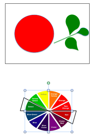
As can be seen on the colour wheel above, the complementary for each primary colour is a secondary: red/green, orange/blue and yellow/violet. Each of the colours varies in brightness and were awarded light values, by Goethe, the German poet and playwright. The values he determined are yellow 9, orange 8, red and green 6, blue 4 and violet 3. Freeman (2007, p120) notes that according to classic colour theory, colours harmonise best when their area is in inverse proportion to their relative brightness. Therefore as proposed by Goethe, red and green would combine best at a ratio of 1:1, orange and blue at 1:2 and yellow and violet at 1:3.
Red/Green
Präkel (2006, p81) notes that colours have psychological associations, although these often vary between cultures. He notes that, in western cultures, red is typically regarded as a signal colour associated with warning, action, fire and anger. Conversely, green is considered to have associations with nature serenity and security.
Red/Green 1
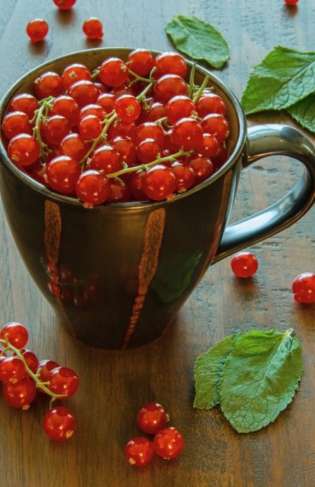
To illustrate the primary and secondary colour combination of red and green I set up a still-life arrangement of red currants and mint leaves on a tabletop. I placed the camera on a tripod at a low height in order to look down onto the contents of the mug. I selected an aperture of f/22 in order to gain a large depth-of-field and I used the camera’s exposure indicator’s suggestion of a 4s shutter speed alongside a remote shutter release. The arrangement is lit from behind, by daylight entering through a window.
The 1:1 colour suggested colour combination of red and green presumes that both colours are pure hues of equal brightness. Freeman (2005, p100) notes that, in practice, there is little point in measuring precise proportions, as colours are rarely pure and exact.
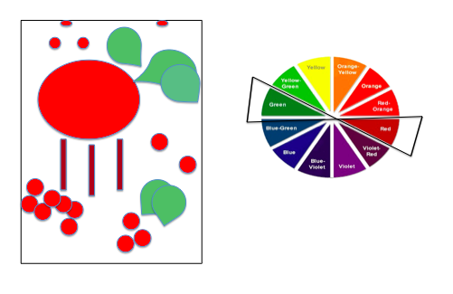 As can be seen in the illustration above, there is approximately three times more red in the composition than green. The colours in this composition are not pure hues. The red contain small amounts of both green and blue while the level of saturation in the green leaves was very low. I increased this slightly by adding some green saturation in PSE 11. Even after this, the levels of green saturation in the mint leaves varies from 22% and 85% depending upon where the light falls.
Freeman (2005, p94) notes that optical vibration, a flickering effect, occurs between two contrasting colours that are similar in brightness, such as red and green. However, as both the colours in this image are adulterated and do not share a sharply defined edge this cannot be seen here. However we can see how the red, a warm colour, appears to advance while the green, a cool colour, seems to recede.
Red/Green 2
It is, perhaps, no surprise that whilst researching the use of colour in photography I found the work of Ernst Haas (1921-86) to be mentioned often. In ‘The Genius of Colour Photography’, Roberts (2007, p136) discusses the way that Haas (1921-86) embraced the change from black-and-white to colour photography and pioneered several new colour photography techniques.
In her text Roberts includes images of Haas’ ‘Parachute Flowers’, 1967 and ‘California Hydrangeas’, 1982. I found the colours and level of details in the flowers to be quite stunning. After looking in more detail at Haas’ flora work on http://www.ernst-haas.com I was inspired to experiment with photographing flowers. The photograph below was somewhat inspired by Haas’ ‘Rose’ 1970 and ‘Red Tulips, Japan’ 1980.
For this shot I use my Panasonic Lumix FZ45 camera as my Nikon D5100 was in the process of being cleaned. Here I have taken a common red/green subject; a single red rose, and attempted to photograph it from above, as Haas did. However, as I didn’t have a macro lens and my close-up filters did not fit the Panasonic, I couldn’t get as close as Haas did. As I also wanted to include some green, I arranged the composition by placing the rose in a clear glass vase on top of a large sheet of white card. I sprayed the rose with some water to emulate a raindrop effect as in ‘Red Tulips’. I then positioned my camera on a tripod above the arrangement and angled it downwards. The Lumix FZ45 has a zoom lens and this photograph was taken at 31.9mm, which is 175.5mm efl. This, along with the f/3.8 aperture and the advancing quality of red, has placed the focus on the flower head and given in a\ 3-D quality.
The flower was lit from behind by light from a window. I had the camera White Balance setting on Shade, but in post-production adjusted this to Auto to eliminate a green/blue colour cast. I also made some adjustments to the shadows, saturation and vibrancy.
Neither the red, nor the green are pure colours. The red in the rose varies in dependent on where the light and the shadows fall. The green is quite pale with low levels of saturation. Freeman (2005, p47) notes that while green is common in nature, pure green is not easy to find. The balance between the red and green is closer to 1:1 than the first image.
Präkel (2006, p81) explains that blue is associated with cold, clarity, space and winter. Freeman (2005, p40) expands on this by noting that blue also has association of passivity and reflection. Orange, being the mix of red and yellow, absorbs some of the qualities of each of these colours. It is considered to radiate energy, light and warmth.
This brightly painted horse is one of many that are dotted around Dubai as a celebration of the Arabian horse. I spotted this horse standing on top of a grassy roundabout on a busy road. Each horse is individually decorated, this one depicts a deep orange coloured Arabic building across the horse’s torso and an orange and blue sky reaching across the neck and head.
The hotel building, which stands in the background, is also a pale orange which means the composition is heavily dominated by orange. As the illustration below shows this image does not comply with the 1:2 orange to blue ratio that is suggested as being ideal.
However, Freeman (2005, p103) notes that the combination of the two hues, orange and blue alone, is enough to produce a general sense of harmony. The eye is drawn to the smaller area of colour, in this case the bright blue on the horse’s ear which acts as a colour accent, then travels down to look at the orange/blue artwork on the horse’s body. The wide aperture also helps the horse to be well-defined against the out-of-focus background. Close inspection of the horse finds that the varnish is peeling and the paint is fading from the Arabic scene in the artwork, possibly due to time and weather. I quite liked this effect as I feel it helps illustrate the result of the harshness of the sun and high temperatures in this region of the world, particularly at this time of year.
Violet/Yellow
When discussing colour associations, Präkel (2005, p81) notes that yellow is considered to be the colour of the sun and therefore associated with heat, life, joy and summer. Violet, a mixture of blue and red has varied associations ranging from religious, regal and superstition.
Yellow, the brightest colour, and violet the darkest of pure colours combine to make the third pair of complementary colours. The suggested ratio for combining these colours is yellow 1 and violet 3.
For this photograph I chose to continue to work with flowers and set up a simple still life of a vase of tulips with a white background. To achieve the suggested colour harmony ratio I used 1 yellow tulip and 3 violet toned tulips.
The arrangement was being lit by daylight through a window on the right hand side. I, again, used my Panasonic Lumix camera in Manual mode. I experimented with various viewpoints and framing options before taking this close-up shot with the arrangement extending beyond the frame edges with the lens set to 11.8mm (64mm efl).
The large aperture of f/3.6 has created a shallow depth of field which places focus on the middle two tulips. The tulip stems are leaning at angles, which add some dynamism to the composition. It was only when studying the image later that I noticed that as the stem of the left hand tulip is leaning towards the left, while the others lean-to the right, two sides of an inverted triangle are suggested. This helps to inject some tension and movement into the arrangement.
The white background had taken on a slightly green colour cast from the foliage and I experimented with various photo filters in PSE 11 to eliminate this. I added a violet photo filter at 25% density as this enhanced the violet tulips and made the background a more neutral gray/blue.
Freeman (2005, p49) notes that violet is a relatively difficult colour to find for a photograph. The violet of the tulips in this image is not pure violet but varies to include thistle, red/violet and orchid. The yellow here is not a pure hue either but its brightness helps it to stand out prominently from the darker hues.
Colour harmony through similar colours
Choosing sets of neighbouring colours or opting for variations in saturation and brightness from a narrow set of hues can also achieve colour harmony. Freeman (2007, p120) explains that colours next to each other on the colour wheel go well together because they present no conflict.
Warm Colours 1
The idea for this shot came from a photograph in a magazine. The photograph was advertising a range of supermarket’s wares of red, orange and yellow and included colour accents of green. To create my own version, using that are close to each other on the colour circle I arranged cheese, biscuits, cherry tomatoes, fruits and olive oil on top of a wooden board. The arrangement was lit from behind by the sun shining through a window. I positioned my camera on a tripod and positioned it above, and looking down onto, the arrangement. I wanted to over fill the frame to give the impression that the arrangement extended beyond the frame edges, so in order to get close enough to the arrangement I added a +2 close-up filter to a tele-photo lens set to 55mm. I set the aperture to f/22 in order to maintain a large depth of field.
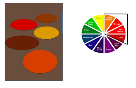
The colours in this image are all modulations of red, orange and yellow which sit beside each other on the colour wheel. Freeman (2005, p114) notes that there are strong associations between colour and temperature. Red, orange and yellow are all considered to be warm colours with associations with heat, light and energy.
Warm Colours 2
The inspiration for this image, again, came from a photograph in a magazine. I originally intended to set it up to reflect a colour accent but quickly realised that it would work well to show harmony through similar colours. I wanted a simple arrangement that would primarily show the warm colours of various spices, which would help suggest the heat from the spices themselves.
I arranged 5 dishes on my kitchen counter and added different spices to each. From front to back the contents are dried chilli powder, dried peppercorns, turmeric, dried chillies and cloves. The arrangement is being lit from above by halogen bulbs and from the left side by a small desk lamp. I aimed the small desk lamp at the dish of turmeric as this the brightest and most saturated colour in the arrangement. I set my camera on a tripod and adjusted the White Balance to tungsten to compensate for the overhead lighting. However, during post-production the white balance still did not look ‘right’ and I experimented with colour filters to remedy this, eventually settling on a ‘deep blue’ filter at 25% density. An aperture of f/5.3 has created a shallow depth of field that has rendered the front and back dishes slightly out of focus and placed attention on the middle three dishes.
The colours in this image are rooted from orange and red, which sit beside each other on the colour wheel. The range of colours include; the firebrick red of the dried chilli powder, the dark brown of the peppercorns, the almost orange of the turmeric, the reddish-brown of the dried chillies and sienna in the cloves. Präkel (2006, p81) notes that alongside red and orange, brown is also a colour that signifies warmth.
Cool Colours
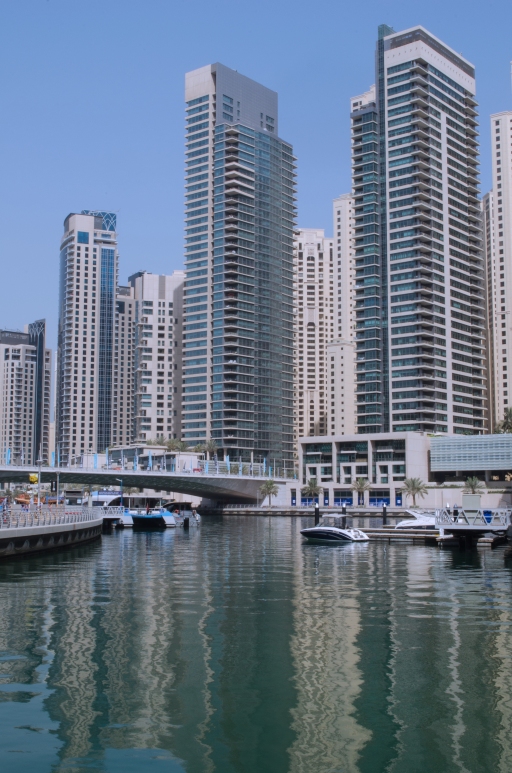
I spotted this scene whilst on an early morning walk around Dubai Marina. I noticed how the colours, modulations of blue and green, give the image a cool, calm feeling, added to, by the still waters in the foreground.
I experimented with framing and varying my viewpoint slightly as I wanted to ensure I included the water. I liked the way that the different blue/green shades seem to merge into vertical blocks of colour in the reflection. With my lens focused at 30mm I selected the smallest aperture I had, f/32 to keep the focus crisp across the image.
With the exception of the sky the blues and greens in this image are all man-made. The colours vary enormously; the sky a pale sky blue, touches of light turquoise in the tower windows, an almost cornflower blue on the boats and flags on the right of the image and small amount of midnight blue on the shop unit fronts. In PSE 11 I added a cooling filter (80) to the image which helped to make the blues appear bluer.
Green/Orange/Yellow
I took this photograph of a row of shops in a Dubai shopping mall with a wide-angle lens set to 22mm. I chose this viewpoint and the vertical format to enable the colours of the shop fronts to be seen whilst including the green rooftop arches.
While the colours, green, orange and yellow, all sit next to each other on the colour wheel, green is considered to be a cool colour while yellow and orange are associated with warmth. The colours are adulterated with pale yellow and shades of green, close to olive-green and sea green, making up the majority of the composition. The coral/orange colour is more saturated than the other colours and this, along with its brightness, draws the eye.
Colour contrast through contrasting colours
Contrasting colours are colours that are spaced approximately a third of the way around the colour circle. The colours contrast because they are very different, but not complementary. Contrasting colours are not described as harmonious but tend to be visually striking.
Violet/Green
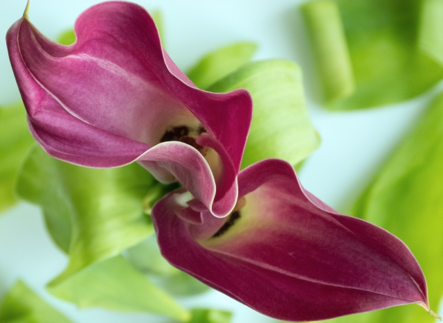
Again, inspired by the flora work of Ernst Haas, I set up a still life flower arrangement to illustrate the colour contrast of violet and green. I placed two calla lilies in a small vase and sat this on top of white card. I added some tulip leaves to the vase top and arranged a few on top of the white card. The arrangement was lit by daylight from a window.
I positioned my Panasonic Lumix camera on a tripod and pointed it directly down onto the flower heads, as I wanted the curved outline of the flowers to be prominent. I adjusted the position slightly to fit the flower heads diagonally across the frame. I chose an aperture of f/3.7 to place emphasis on the flowers and separate them from the background.
The flowers are not a true violet, perhaps closer to a medium violet red. The green also is adulterated and is very pale. The illustration below shows these contrasting colours position on the colour wheel.
Whilst reading Roberts’ (2007) text I came across the Les Manèges (1978-82) series of work by John Bathos (b.1939). The photographs seem to capture the excitement of fun fair rides in a whirl of movement and colour. In researching Bathos further, I noted his bold use of colour in his works Photocolore (1975-86), arrangements of brightly coloured. and seemingly mundane, items and also in Parasols (1977-2004), which show brightly coloured beach tents as sculptures on a deserted beach. Both of the sets of work have, in some way, inspired the next image, a bright red beach parasol photographed against a light blue sky.
I experimented with different framing before deciding to shoot from underneath to include some of the diagonal spokes which lead the eye towards the blue of the sky. The simplicity of the shot means that the colours red and blue, and the shape of the parasol dominate the composition. The photograph was taken with my Panasonic Lumix camera with the zoom set to 7.3mm (40mm efl). The illustration below shows the contrasting positions of red and blue on the colour wheel, approximately a third of the way apart around the colour circle.
Red/Yellow
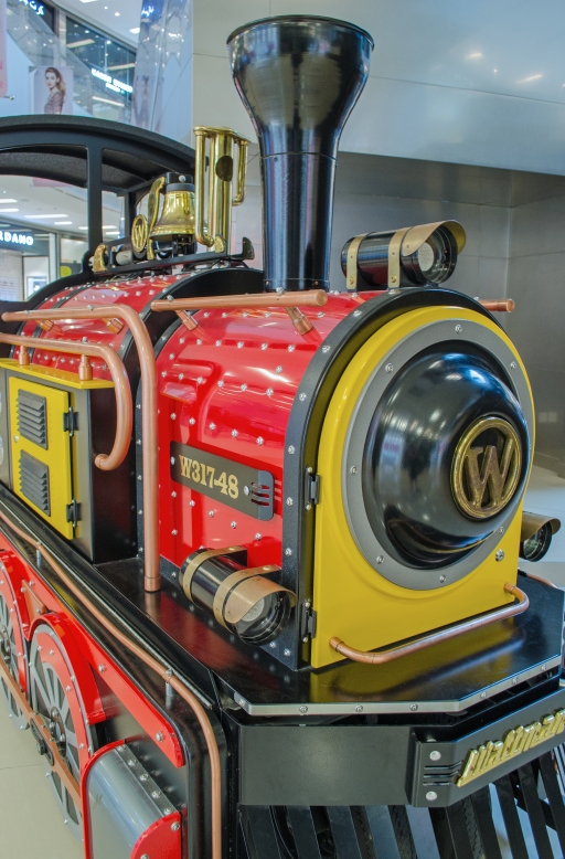
This photograph shows a model steam engine that, for a small fee, takes children on a ride around the inside of a shopping mall. I deliberately arrived at the mall early in order to photograph it without it’s usual load of passengers.
After a few test shots I placed the camera’s WB setting to tungsten to counter act the artificial light inside the mall.
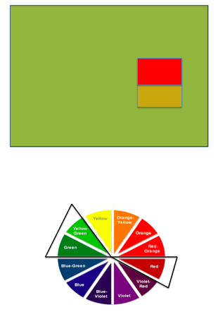
The engine of the train is painted with bright red and yellow paints, which are contrasting colours. The metallic gold bell also appears as a yellow as can be seen in the colour illustration below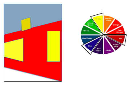 Both colours are powerful and are often used to draw attention, in this case, the attention of young children. Red and yellow are both warm colours that appear to advance towards the viewer (Freeman, 2005, p115). This can be seen in this image with the red and yellow standing out boldly against the neutral greys of the mall background.
Blue/Yellow
I recently came across the work of Joel Meyerowitz (b.1938) in Roberts (2007, p172) and found the images from his Cape Light book to be very powerful. The photographs were taken by Meyerowitz in Cape Cod while on family vacation. The images show the sea, blue skies and fluffy clouds in pastel colours and shades of blue. I found the overall effect to suggest quiet and calm, while sparking personal memories of holidays and beach trips. The idea for the following photograph is inspired by Meyerowitz’s Cold Storage Beach, Truro (1976) , an image that shows a beach scene with a hazy blue sky commanding about 90% of the photograph. The remaining 10% shows a small strip of pale orange sand, the blue sea and the silhouettes of dozens of tiny figures.
I also wanted to create an image where the blue of the sky dominates the composition, but meets a horizon line After some experimentation I opted for a vertical format and applied the rule of thirds, with the horizon placed low and the sky covering, approximately, the upper 2/3’s of the frame.
The sand had low levels of saturation and I increasing the yellow in PSE 11. Even after this the yellow of the sand is still very pale, more of a bisque colour, however I didn’t increase the saturation further as I was aware that it would not look ‘right’. For me, the very pale yellow sand is still warm enough to evoke the idea of golden sands. The temperature when I took the photograph was around 40c at 9am and you can see a hazy effect in the modulations of blue between the upper sky and where it meets the horizon.
The blue/yellow contrast is illustrated below.
The girl sitting on the beach was a happy accident. She arrived just as I was about to move on and I realised that including her in the composition on the right would balance dynamically with the row of houses on the left. Blue is considered to be a quiet, contemplative colour and this alongside the solitary figure on the beach brings a sense of calm, space and airiness to the image.
Colour accent
Colour accent is, essentially, a small area of bright colour positioned somewhere in the frame that contrasts or harmonises with the background colour. Freeman (2005, p110) notes that the spot colour draws the eye, particular, when the colour advances from a retreating background, as in a warm colour advancing from a cool colour.
This assignment asks for 4 photographs which show colour accent through colour harmony or colour contrast.
Colour accent through colour harmony
Green/red
I took this photograph of a warning sign while walking at a nearby duck pond. The colour harmony is through complementary colours, red and green.
The red, a warning colour, acts as a colour accent, drawing the eye, while the writing also adds visual weight. Using an aperture of f/4.8 has allowed the background, foliage reflections on water, to become a blurry mixture of olive-green shades. The red and coppery-orange of the warning sign are both warm colours that appear to advance against the cool greens of the background.
Violet/yellow
I recently read Bryan Peterson’s, Understanding Composition Field Guide (2012) and was interested in what he terms ‘mining the mundane’. He explains that everyday objects and situations, the mundane, can be arranged to become compelling images. With this firmly in mind I consciously began to look at some of the everyday items that I come into contact with in a new light.
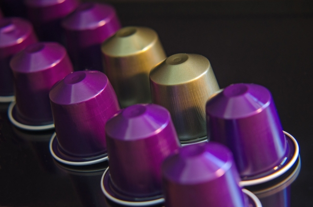
This was the case in the image below. It is a photograph of upside-down metallic coffee capsules, sitting on top of a black I-pad screen. I arranged the capsules diagonally across the frame to add some dynamism and movement to the otherwise static objects. I positioned my camera on a tripod and experimented with different viewpoints using a close-up filter of +2 to allow me to focus at a closer distance.
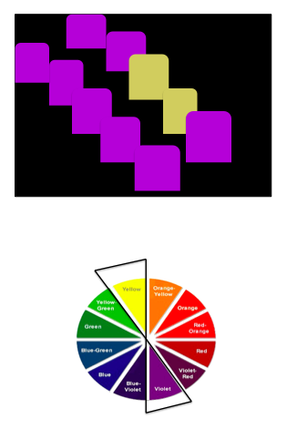
I chose the capsule colours, pale yellow and purple, to mirror the complementary relationships between yellow and violet. The suggested ratio for combining these colours is yellow 1 and violet 3, however Freeman (2005, p110) notes that when there is an extreme difference in proportion between colours, as in colour accents, the suggested ratios become irrelevant. The yellow accents break up the pattern of the diagonal arrangement.
Freeman (p124) continues by noting that as metallic surfaces have fairly high reflectivity and therefore can pick up the tones and colours of their environment. With this in mind, I lit the arrangement from the right hand side with a small desk lamp and yellow light bulb. I directed the lamp to the gold capsules to boost their colour and brightness against the dark purple/violet colours. I selected a shallow depth of field, f/4.5, and focused on the pale yellow/gold capsules to emphasis the colour accent further.
In PSE 11 I also added a magenta colour filter to the image to move the purple colour of the capsules closer to a dark violet.
Colour accent with contrasting colours
Blue/yellow
The next photograph was also inspired by Bryan Peterson’s (2012) approach of arranging everyday, often overlooked objects, in the frame to make a successful image.
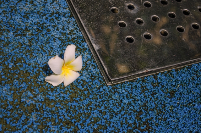
The blue area in this photograph is the base of the fountain that was switched off. It is something thing that I walk past several time per week, although rarely is the fountain switched off. The brightness of the blue caught my eye particularly as it is in a park area surrounded by green trees and plants. A single desert rose flower sat a little bit away from the metal drain. After looking at this through the viewfinder I moved the flower to make it slightly off-centre and therefore a moderately dynamic position and also to ensure it’s yellow centre was visible. I included the metal drain cover as it adds some visual interest, in terms of diagonal lines and circle details, while it’s neutral grey colour does not detract from the yellow colour accent.
Blue, a colour considered to be cool, and yellow, a warm, bright colour, are both contrasting colours. They are not similar or complementary and are spaced approximately 1/3 of the way apart on the colour wheel.
I also like the contrast in textures that this image shows; gravelly ground, smooth metal and the soft flower petals.
Colour contrast or colour harmony?
Blue/yellow/red
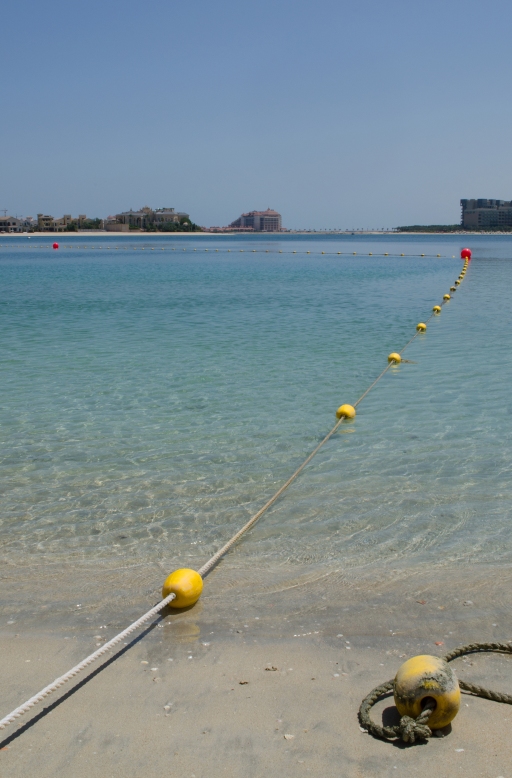
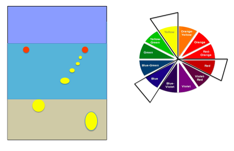
This photograph shows a beach scene, dominated by shades of blue in the sea and sky. A buoy rope crosses diagonally right across the frame, before changing direction and moving left to mirror the horizon line. The buoy is dotted with yellow buoys, which act as colour accents leading the eye along the rope. There are two red buoys that also draw the eye, punctuating the rope’s change of direction.
I selected a wide-angle lens, set to 28mm to accentuate the perception of depth and the diagonal created by the buoy rope. To emphasis the sea and colour accents I applied the rule of thirds and positioned the horizon in line with the upper third of the frame.
Red, blue and red are primary colours and are arranged symmetrically around the colour circle, a balance that is considered to be a harmonious colour relationship. However, as the colour proportions vary hugely in this photograph, and given the nature of the photograph content it is perhaps better to describe the colour accent as being achieved through colour contrast rather than harmony. Contrast between the perceived temperatures of the cool blue colours and the warm colour accents, yellow and red.
Conclusions
Although this has been a relatively short chapter in the TAoP course, it has taken me some time to get through. I initially found the difference in reflected light and transmitted light difficult to comprehend, but further research has helped me to better understand these concepts. In particular, I found Michael Freeman’s Colour, Digital Photography Expert (2005) to be extremely useful in explaining these technical aspect and also the perceived colour associations.
Research I have undertaken throughout this chapter has also introduced me to the work of photographers such as Bathos, Haas and Meyerowitz, which I found to be exciting and inspiring.
I have come to be more conscious of how the colour I see around me have been used, not only in the photographs I view, but also in advertising, design and packaging.
On commencing this chapter I had difficulty differentiating between a violet and a purple. I also feel more able to discern subtle differences between hues. I found this hue checker tool http://www.xrite.com/custom_page.aspx?PageID=77&Lang=en while reading a fellow student’s blog. A perfect score is 0 and on first attempt several months ago I achieved a score of 16/99, however a percent attempt noted a score of 8, a definite improvement.
Overall, I have found this chapter to be interesting in terms of the emotional, psychological and cultural associations of colour, to which I had previous given little thought other than my own personal experiences and preferences. Therefore I found it extremely interesting to note the widely accepted associations and cultural variations. I again, have become to notice how this is used in advertising and packaging, for example purple/violets used to suggest luxury.
The focus of this assignment has been colours in deliberate relationships, which are generally agreed to be acceptable to the majority. However, I think it appropriate to reiterate the point that Freeman (2007, p120) makes when he notes that we should balance this knowledge with personal expression to realise creative use of colour.
Light next…
Freeman, M. (2005) Digital Photography Expert-Colour. Lewes: ILEX
Freeman, M. (2007) The Photographer’s Eye. Lewes: ILEX
Peterson, B. (2012) Understanding Composition Field Guide. (Kindle Edition) New York: Amphoto Books
Präkel, D. (2006) Composition. Lausanne: AVA Publishing SA
Roberts, P. (2007) The Genius of Colour Photography. London: Goodman
http://www.xrite.com/custom_page.aspx?PageID=77&Lang=en

