Category Archives: Coursework

Rain

Rain

Introduction

This exercise asks use to produce a photograph to a specification, whilst ensuring that the image is strong and attractive. The photograph is for a magazine and should illustrate the subject of rain.

The course notes offered, amongst others, the following advice-

  • Think of all the effects of rain that you have ever seen
  • Keep it simple
  • Be interesting
  • Make the photograph attractive

Exercise

I tackled this exercise several months ago while I was in Scotland due to seemingly infinite supply of rainfall!

I initially had the idea of shooting the low-lying rain clouds that shroud the hills near my home in Scotland. However, when I tried to capture these things didn’t go to plan. I fitted my camera with a newly acquired rain cover and set off. The first problem was that I found the rain cover made the camera very awkward to control and with a wide-angle lens attached the plastic kept slipping over the lens. Secondly, the low light levels of a wet January day made hand-held shooting difficult and thirdly the resulting photographs were very grey and flat. Not attractive at all.

I returned to the drawing board and using the guideline above, think of all the effects of rain you have seen, I brainstormed a selection of keywords that sprang to mind. These included:

Puddles, rain drop splashes

Ducks, (as in this is a day for the ducks)

Rainbows

Floods

Umbrellas

Oil slicks

Mud/ Muddy boots

Drips

Raindrops on windows

I reasoned that in order to achieve an attractive photograph worthy of a magazine cover the image needed to contain colour in order to grab a reader’s attention from a newsstand. I decided to explore the idea of a still-life arrangement involving umbrellas, which in turn led me to the idea of boots and in particular Wellington boots.

I experimented with different arrangements, combining the umbrellas and boots before realising that the boots alone in the frame worked better.

Wellington boots, 50mm, f/6.7, 1/125s, ISO 100

Wellington boots,
50mm, f/6.7, 1/125s, ISO 100

The composition is simpler allowing the viewer to make the connection between the boots, raindrops and wet autumn leaves. I use a Speedlight to light the scene while increasing my shutter speed by 2 stops to kill the ambient light which was causing large reflections on the boots. The darker background also contributes to the idea of a dull, rainy day.

The colour of the boots immediately catches the eye. Whilst the diagonals produced by the paving stones both frame the boots and lead the across the frame.

I imagined that this could be the front cover of a ‘parenting’ type magazine, winter or autumn editions.

I did consider shooting from lower and having the top of the boot extend beyond the top of the frame, however I decided upon this composition as it leaves ample room for a masthead at the top. It also has adequate space for headings and captions at both the right hand and bottom.

Conclusions

Considering the amount of access I had to rain it was more difficult than I had anticipated creating an attractive picture. When you see a rainy street scene in a magazine someone is usually wearing a red coat or standing under a yellow umbrella, or loitering outside a bistro which is emanating a warming glow. Not necessarily so in reality.

The next time I see a ‘rain’ type photograph I will be more attentive to see what makes it work, whether it be lighting, colour accents or simply the content


Juxtaposition

Juxtaposition

Introduction

Freeman (2007, p178) describes juxtaposition as bringing two things (at least) to our attention at the same time. Viewers have a tendency to assume a relationship between things seen side by side. The connection that is suggested then provides the foundation for illustration. He explains juxtaposition further by noting it has two sources. The first is content, where the initiative comes from the subject, and some thought is applied to achieve this. The second is graphics, where the inspiration comes from a chance appearance, such as reflection in a window to include a second element.

Exercise

For this exercise I have a content driven motive. I am going to set-up a still-life using two or three elements that, when juxtaposed, will provide an illustration for a book cover. The course notes stress that originality is an important factor, and that if a photograph is not interesting to do, it will probably not be interesting to look at either.

I decided to use the novel that I have just finished reading as the basis for this exercise, ‘Notes from an Exhibition’, by Patrick Gale. The book tells the story of an Artist, Rachel Kelly. At the beginning of the book Rachel is found dead following a heart attack. The story of her life up to that point then unfurls, noting the whirlwind of creative highs and anguished crippling lows due to her bipolar disorder. It also describes her being alternatively wonderful and terrible to her husband and four children.

'Notes from an exhibition', 46mm, f/9.5, 1/8sISO 320

‘Notes from an exhibition’,
46mm, f/9.5, 1/8sISO 320

I chose to use artist’s tools, such as paints, brushes, small easel stands and palette as the main elements of the composition to directly link with the painter at the heart of the story.

The broken photo frame in the foreground was a happy accident. I originally planned for the small print to sit in one of the easel stands but as I setting up the still-life I accidentally knocked it off the table. I decided to include it in the frame to help symbolise the fragility of Rachel’s condition and the fragmented family she leaves behind.

The six pebbles on the left are directly linked to the story as Rachel’s youngest child gave her six pebbles to represent a member of their family. Rachel treasured these stones and was undertaking a series of paintings inspired by them at the time of her death.

I chose to include the pile of tablets as a reference to Rachel’s illness. I chose 6 to mirror the number of pebbles.

I shot at f/9.5 to keep most of the focus on the foreground of the photograph with the top a little out of focus, as this is where the title/author’s name could sit. I also left some room at the bottom for this too.

I wanted some dramatic lighting for the scene so positioned my Speedlight, with diffusion dome, in the top right hand corner, just out of frame. I positioned it low to allow shadows to be cast from the easels. My initially attempts as this left the foreground quite dark so I placed a white reflector at the bottom left of frame to bounce some light on to the foreground.

Conclusions

While I do like the overall effect of the final image, lighting, diagonal lines, colour accents, I think now, with hindsight that I possibly have too much going on in the frame. If I were shooting again I would perhaps have omitted the medication to simplify the composition.

However I have still found this to be a useful exercise as it gave me an opportunity to really consider the way different elements relate to each other and experiment with symbolism.

Juxtaposition is a technique that I have unconsciously been using when setting up still life arrangements or deciding how to frame photographs taken in the wider world. Now that I am aware of this technique I can give it more considered thought and apply it to better use in my photography.


Freeman, M. (2007) The Photographer’s Eye. Lewes: ILEX

Symbols

Symbols

Introduction

Simply put, a symbol is something that represents something else (Short, 2011, p124). Short continues by explaining that a symbol does not resemble the concept it represents, instead the relationship between the two must be learnt.

When discussing symbols, it is important to note that symbolic interpretation can vary enormously. Will some symbols may seem to be universally understood, such as heart to mean love, many more will be interpreted differently depending on the viewer’s social, political and cultural experiences.

Symbols to represent concepts

This exercise asks that I find symbols to represent a number of concepts and consider how they might be used in a photograph. The concepts are: growth, excess, crime, silence and poverty.

Growth- Symbols could include:

  • a small plant or seedling breaking through the earth, the colour green also has associations with nature, which is directly linked, to growth.
  • a close-up shot of a flower bud
  • a graph showing an upward trend, this could be used as a prop in a still life-arrangement or on wall in the background of an office environment.
  • a heavily pregnant woman, if she was already pushing a pram this could show growth also in the size of her family.
  • A child’s height being measured against a doorframe with the previous (smaller) height being visible.
  • The construction of a high-rise building, particularly if its neighbours were low rise buildings.

Excess- Symbols could include:

  • a plate piled high with food. Close up shot, including a hand holding a piece of cutlery to show scale.
  • an overflowing recycle bin with empty beer and wine bottles.
  • a bulging stomach over a waist band, focus only on torso area
  • an overflowing suitcase, with someone sitting on it, attempting to force it closed.
  • Money, arranging notes so that they overfill the frame.
  • Luxury car, detail shot of the car logo.
  • Jewellery, shot with a jewellery box. Arrange necklaces and pendants etc. so that they appear to be spilling out of the box.

Crime- Symbols could include:

  • The stereotypical image of a burglar with a stripy jumper, eye mask and bag of swag.
  • CCTV camera, close up shot
  • Dark alleyway, shadowy figure, perhaps wearing a hoodie as in some areas of the UK they have been perceived as being associated with youths and anti-social behaviour.
  • Graffiti or vandalism. Could be in the background of a scene to convey idea of unsafe area.
  • Yellow police crime scene tape around an area or building.
  • Chalk outline of person on the ground as though a murder has taken place.

Silence- Symbols could include:

  • Finger on lips, probably the most cliché symbols for silence. It seemingly arises from Mythology.
  • Children studying. Heads bent down towards their desks and books.
  • An ‘Exam in Progress’ sign, hung on a closed-door.
  • Hands covering a mouth, as in one of the Three Wise Monkeys who speaks no evil.
  • A landscape scene, showing no people or movement. Including a section of still, calm water would also reinforce the idea of silence.
  • A cemetery, again showing no people or movement
  • Monks praying together. Heads bowed.
  • Someone sitting cross-legged in a yoga style pose with his or her eyes closed as though meditating.

Poverty- Symbols could include:

  • An outstretched hand with palm face up, as though waiting to receive something. Could be shot with one hand to emphasis the empty palm of many hands in the frame to stress the scale of the need.
  • Empty plate, held forward. This could be shot as above, with one plate or many plates.
  • A street beggar. It could be shot sensitively by only including a ‘Please help’ sign and the receptacle for the donations.
  • Queues for food at food banks or food kitchen. Could be shot from the back of the queue towards the source of food.
  • Bare-foot child. Often seen in newspapers and in charity publications to raise awareness of the plight of many people suffering from the effects of famine, drought, war or natural disasters.
  • Shantytowns. Photograph taken from a distance to illustrate the scale of town.

Conclusion

Although this has been a brief exercise it has given me a lot of scope for thought. I find myself looking more closely at photographs in advertisement to note how symbolism has been used whether through objects, colours, weather or even time of day.

However, Short (2011, p126) cautions that the appearance of a sign or a symbol in a photograph may not have been a predetermined or orchestrated consideration of the photographer. She explains that while set photography offers a photographer time and control, photojournalism and reportage do not and often photographers have to make on-the-spot decisions about what to include.

This seems to emphasise the fact that reading a photograph is very personal. Viewer’s interpretations could be very different from a photographer’s intention and can vary widely based on the their prior experiences and understanding.

Short, M. (2011) Context and Narrative. Lausanne: AVA

Evidence of Action

Evidence of action

Introduction

While narrative in photography is the use of a sequence or series of photograph to tell a story, illustration is largely a matter of conveying a story in a single image.

Freeman (2012, loc 911) notes that the idea of a story in a single picture has long persisted as being the ideal, particularly among documentary reportage photographers. He notes that Henri Cartier-Bresson, a Magnum co-founder, saw a picture story second best to a single great image, although he conceded that for magazine story assignments a set of images was often unavoidable.

So, how can a single image successfully convey a story? Short (2011, p109) argues that in a single image the story can be drawn from all the components of the picture and how they appear at the time of photographing. She suggests that the components could raise questions from the viewer and offers examples such as: what is the picture of? What is happening? What is the relevance of the empty space/dark sky/ colour of the carpet?

The course notes agree, and state that even a very simple relationship between the components of the photograph can help a story develop.

Part One- Conveying abstract ideas and concepts

The exercise instructions note that illustration is particularly useful in dealing with subjects that are not straightforward solid objects or obvious events. It asks that I make a brief list of concepts that are regularly depicted in advertising and publicity, which cannot be shown directly.

Health-  A concept that features regularly in advertisements and in magazines. This could be conveyed through an image of someone involved in a sport and shot to either freeze the action or with a degree of motion blur to illustrate movement. A piece of sporting equipment could also be included in the composition such as a tennis racquet or a football. I noticed a full-page magazine advert for Nike, which shows a runner mid stride from the ankle down, so almost the whole ad was the running shoes.

Shots of colourful, raw fruit and vegetables arrangements are also often used.

Stress- A concept often shown in magazines right beside the adverts for massage, yoga and financial products. This could be shown by a photograph of a face with a furrowed brow, someone with their head in their hands or massaging their temples. It could also be shown by a pile of overdue bills or an overflowing in tray of work.

Sex- Many companies, particularly alcohol, fashion, perfume and cars manufacturers, frequently allude to sex in their advertisements. The women are beautiful, the men are handsome. Clothing is generally fashionable although bare flesh can feature heavily too as in the Calvin Klein jean ads http://www.theaustralian.com.au/executive-living/fashion/photos-e6frg8k6-1226246702697?page=1 and in the Pirelli calendars http://www.pirellical.com/50years/. The body postures are often slightly provocative. The colours red and or pink are often included as they are commonly associated with romance and sex.

Friendship- Commonly conveyed through showing smiling children at play, handholding etc. It also is shown in adverts for pet food and products by pairing a smiling human alongside an obedient dog or content cat.

Equality- This is shown across advertising campaigns by including a mix of both sexes and ethnicities. Gender equality can be alluded to by scenes, which challenge traditional male/female roles. For example, a man cooking an evening meal or feeding a baby or of a female in a business suit in a boardroom or as a firefighter.

A set of balanced scales could also be symbolic of equality.

Part Two- Illustration

I am asked to produce a photograph in which it can be seen that something has happened. The course notes offer the suggestion of something that has been broken, or emptied.

Freeman states that it is difficult for single images to illustrate a story (without captions) if the audience is unfamiliar with the photograph setting and also if the story itself is not simple. I bore this advice in mind as I planned the exercise. The course notes also offered advice by suggesting the photograph could depict something that had been broken, or emptied.

1.

1. 24mm, f/10, 1/500s, ISO 100

1. 24mm, f/10, 1/500s, ISO 100

I took this photograph of an unoccupied service facility just a few minutes from my apartment building. The graffiti and smashed window both show evidence of action, in this case vandalism. Layers of sand and dust had built up on the remaining glass in the window frame, which adds to the sense of neglect and also blocked any distracting reflections (my own included).

2.

2. 78mm, f/5.6, 1/8s, ISO 100, +2 close-up filter

2. 78mm, f/5.6, 1/8s, ISO 100, +2 close-up filter

I decided to include a second photograph, using a familiar context to help convey the idea that something had happened. I set up a very simple still-life, a saucer, teacup and some biscuits. The action shown here is that someone had taken a bite out of one of the biscuits, illustrated by the bite marks and crumbs. I opted to focus closely on the bite mark using a close-up filter +2 to do this and a wide aperture to gain shallow depth of field. I positioned a 500w continuous photographic light at a low angle and to the right-hand side to try and emphasise the texture of the biscuit.

Conclusion

Showing illustration in one image was more difficult than I initially thought, as I wanted the photograph to stand on its own without requiring any captions to explain it. I think the second image probably achieves this better than the first, as the context and content are both familiar to the majority of viewers, allowing them to read the scene.

This is aligned with Freeman’s advice on telling a story in a single image; keep the story simple and the setting familiar.

This exercise has also encouraged me to consider the idea of conveying abstract ideas and concepts through symbols and props, which is not something I have consciously done before. I will continue exploring the idea of symbolism in the next exercise.

Freeman, M. (2012) The Photographer’s Story: The Art of Visual Narrative. Lewes: ILEX (Kindle Edition)

Short, M. (2011) Context and Narrative. Lausanne: AVA

Narrative

Introduction In photography, a narrative is the way of telling a story through a set of photographs. The set of photographs, usually anything from three to more than a dozen, form a photo essay. The term ‘photo essay’ was coined in a Life magazine advertisement in 1937, as they promoted the photographic story as being superior to a simple collection of pictures (Freeman, 2012, loc 108). Technological advances had made cameras faster allowing for more candid shots and public appetite for seeing world events in photographs grew. In response to this many other pioneering illustrated magazines across the globe expanded the use of photo essays in the 30s, 40s and 50s. Freeman (2012, loc 108) notes that the rise of the photo essay also allowed magazine editors to extend more control over the selection and sequence of images that were published.

Exercise- A narrative picture essay The course notes ask that I explore the idea of narrative by setting myself an assignment and then photographing it, to tell it’s story. After selecting, researching and photographing the story I should give careful consideration as to how I layout the photographs to create interest between the images and ensure they hang together as a set.

Research and Preparation The course notes advise that a narrative treatment is best suited to subjects made up of several parts or events that have a sequence of things happening, and uses an example of a street parade. However, as I was tackling this exercise whilst in Scotland, in zero degree January weather, there seemed to be a lack of interesting public events even after scouring through newspapers and websites to look for upcoming events. I decided to change tact slightly after reading a section of The Photographer’s Story, the Art of Visual Narrative (2012) by Michael Freeman. He discusses loosely grouped classifications of photo essay and lists them as

  • People Stories
  • Location stories
  • “Making-of” stories
  • Commodity stories
  • Activity stories
  • Collection stories
  • Institution stories
  • Concept stories

This helped me to broaden my thinking and I began to consider the idea of location and/or institution stories. This idea developed as I attended a Jack Vettriano exhibition in Glasgow. The exhibition was being held in the city’s Kelvingrove Art Gallery and Museum, a majestic building, constructed in 1901 in a Spanish baroque style. Aside from the temporary Vettriano exhibition the museum and gallery is home to over 8000 objects and artifacts. I decided that the building and it’s permanent exhibits could be interesting subjects for a photo essay and extended my visit to scout out potential shots and enquire about gaining a photograph permit. Following this, I used a structure suggested by Freeman (2012, loc 1335) to sketch a picture script under the headings-

  • Events
  • Locations
  • Set Ups
  • Activities
  • People
  • Add-Ons

The Shoot I initially considered using a ‘typical day at the galleries’ approach, perhaps by recording shots throughout the period of a day. However, I then decided to use a place a more ‘travelogue’ style. Where each picture would show an aspect of the ‘story’ that builds to give an overall impression as discussed by Short (2011, p102). Freeman (2012, loc 1083) labels this type of story a location story. He notes that the while the most well-known aspects of the site should be shot, the key to making the a location story work, is to try to capture it’s character. This involves spending time to get the personality of the place and the details. I planned the shoot for mid-week to avoid the increased visitor numbers at the weekend and arrived early in the day. I began shooting as I approached the gallery and museum, as I wanted this type of shot for the narrative opener. My previous trip had made the layout familiar and this helped me to navigate my way around the 22 different galleries. One of the main activities I wanted to capture was the organ recital that takes place at 1pm. I therefore found a good position to shoot from and set myself up before this time. The lighting inside the gallery was quite low in places, which meant I relied on the use a tripod a lot of the time. There seemed to be a mixture of lighting types to which called for some creative use of WB. I had planned to take some shots of the buildings exterior during the golden hour/blue hour but unfortunately my camera battery died. This meant that another visit had to be planned to do this. However, I did learn a valuable lesson.

Selection and layout of the photo essay Keeping in mind the need to keep the photographs selected interesting, attractive and varied I narrowed my selection of photographs down to 25 and printed these off on a contact sheet. I then cut into individuals and began experimenting with layouts. I spent some time looking for software that would help me display an attractive layout on-line, although I eventually used Word for its simplicity and familiarity of use. Freeman (2012, loc 190) notes the need for structure in a story. He outlines the four essential elements of a story structure as

Opener– very important, as in photography this has to grab the viewer’s attention

Body– can be any particular length, but should be appropriate to the interest level of the story.

Climax– the key shot, the highest-impact photograph in the set

Closer– should bring completeness to the story He also stresses the need for rhythm and pacing (2012, loc 369) when putting a series of photographs together. Rhythm is described as visual and emotional variety in sequence while pacing is when key shots are held back until the right time.

Opener

Opener and page 2

Opener and page 2

Page 1. I selecting this photograph as the narrative opener for a few different reasons. It shows the galleries from the exterior, establishing its location. It also shows a curving road that leads the eye, and also visitors, to the building. Compositionally, the balance is quite dynamic. The section of grey, cloudy sky also provided ample room for a heading and text.

BodyPage 2. I continued by selecting two further shots of the building’s exterior, albeit this time closer up. It could appear that the viewer is gradually getting closer to the building. I paired these together due to their similar content and colour scheme.

page 3 and 4

page 3 and 4

Page 3 and 4. Again, pairings of similar, subtle colour schemes. They both have vertical formats, however I cropped and resized ‘Griselda’ to add a little variety to the layout. I placed the arches on the left as I thought this might help lead the viewer’s eye across the page. I also like the way that the eye lines of the portraits and the sculpture all look in the same direction.

Page 5 and 6

Page 5 and 6

Page 5 and 6. I selected the images on these pages to go together as I wanted them to show the wide range of art exhibited, from traditional to modern. I placed the pop of colour at the top right hand side to break up the, otherwise, neutral coloured layout. I experimented with positioning the ‘floating’ head images as a double spread. I then considered advice from the course notes, which states that, our interest in and familiarity with other people’s faces makes it easy to read people images even when they are very small and therefore decided a small photograph worked just as well.

Screen Shot 2014-02-25 at 5.44.49 PM

Page 7 and 8

Page 7 and 8. I selected this shot for a double page spread as it contains a lot of detail and graphic elements. The larger format allows these to be seen. It’s content is also quite different from what has been seen so far, and also perhaps unexpected, this could be considered to have made it a key shot.

Page 9 and 10

Page 9 and 10

Page 9 and 10. These pages introduced a ‘mini-story’, within the larger narrative. These two images are paired as they are at very different scales, one showing the Kelvingrove organ as a distance, the other close-up.

Page 11 and

Page 11 and 12

Page 11 and 12. Continuation of the story and also the introduction of the organist and the hint of an audience. These figures help the viewer to gauge the size of the instrument.

Screen Shot 2014-02-25 at 5.45.36 PM

Page 13 and 14

Page 13 and 14. These photographs move the viewer on to another part of the museum and gallery, concerning Scottish identity and art. These images were paired together primarily through linked content and similar colour palettes. Although, the yellow colour accent on the sculpture does draw the eye up to the top of the frame.

Screen Shot 2014-02-25 at 5.45.46 PM

Page 15 and 16

Page 15 and 16. This photograph was selected to allude to the numbers of visitors who come through Kelvingrove’s doors each year. I like how the stillness of the exhibits is in direct contrast to the movement of the people. I selected a double-page spread so that this could be seen clearly.

Screen Shot 2014-02-25 at 5.46.03 PM

My thoughts

This is the first time I have, consciously, attempted to create a picture essay. I have literally taken weeks to decide which photographs to select and organise for this exercise. As usual, I think I was over thinking the task. It has taken me a while to realise that the exercise is designed as a vehicle to practice the skills of editing and layout and there is not only ‘one’ correct way do this. The photographer should instead, as advised by Short (2011), consider the brief and the audience for whom the work is intended. I found Freeman (2012) also very helpful is outlining the need for rhythm and pace in a layout and how this could be achieved. Writing the captions also gave me pause for thought, as I did not merely want to outline to the viewer what they could obviously see in the picture. I instead tried to expand upon this using the words to impart further information. The images above can be viewed individually here.

page 1

page 2

st mungo_edited-1


portraits_edited-1


griselda 2_crop


churchill 2

modern art_edited-crop

heads


spitfire


organ 7_edited-1organ 5_edited-1


organ 4_edited-1organ 2_edited-1


myth or reality_edited-1mcintosh tes room


motherless 2


lit tower


Freeman. M. (2012) The Photographer’s Story: The Art of Visual Narrative. Lewes: ILEX (Kindle edition)

Short. M. (2011) Context and Narrative. Lausanne: AVA

21.Narrative and Illustration introduction

Narrative and Illustration

It has taken me quite a bit of time to get started on Part Five of the course due to several factors including moving house, family commitments and just life in general. However, here I go!

Prior to beginning the posts on the Narrative and Illustration exercises it thought it would be useful to define the terms narrative and illustration. This will help me to be clear of their differences and similarities as I carry out the exercises ahead.

The course notes begin by discussing subject and treatment in photography.

Content and Form

Simply put, photography where the subject or content is of paramount importance could be described as putting the subject first. An example of this could be a photograph of a news event. The other end of the scale is where the subject is of little importance but the composition, lighting, colour and other image-making skills are all important, such as an abstract photograph. This is commonly termed to be the treatment.

Both of these examples sit at opposite ends of the spectrum, and are elements of a long-standing issue in art, the struggle between content and form. However, opinions on whether a specific photograph is more weighted towards content or form will vary hugely between individuals, depending on what each person regards to be an important subject. This is an element of how context relates to a photograph.

Context

Short (2011, p28) explains the importance of context as informing the viewers’ interpretation of a photograph. She continues by noting that the same photograph can be used in different contexts and take on different meanings in relation to that context.

She defines context as:

  • the function of the photograph
  • the placing of the photograph
  • the relationship between the photograph and other photographs in the series or body or work
  • use of text and more external factors, such as topicality
  • geographical placing of the photograph
  • the cultural understandings and experiences the audience bring to the photograph.

The above factors are important considerations in narrative and illustration as this involves beginning with the subject, considering what is important or interesting about it, and using this to suggest the treatment.

Narrative

Simply put, in photography, a narrative is the way of telling a story through a set of pictures. It could be considered to be a picture essay containing 3+ photographs. The course notes advise that the narrative treatment is best applied to subjects that are made up of several parts of events. Short (2011, p96) elaborates on this by stating that visual narrative techniques are used to depict or create frames of reference and context. In photography, she describes these techniques as providing meaning, coherence and, where appropriate, a sense of rhythm to an image or sequence of images.

Illustration

The course notes describe illustration as largely a matter of telling a story in a single image. It stresses that a single, strong image can have a lot of impact and often be more memorable than a series. Short (2011, p109) explains that a story drawn from a single image is created by all the components of the photograph and they appear at the moment of photographing. Therefore, it would seem that questions about composition, content, the photographer must carefully consider all elements of design, colour and lighting.

Conclusion

On a basic level, narrative and illustration in photography is the telling of a story. However, it is not just a matter of snapping photographs of an event in a sequential form. The exercises and assignment will require me to utilise the technical skills I have gained so far over the course to help narrate or illustrate through photography. However, initial research has also indicated that the arrangement and positioning of the resulting photographs is also an important factor in how they, and the story, are received by viewers, making these additional points for me to consider.

Short, M. (2011) Context and Narrative. Lausanne: AVA

Shiny surfaces

Shiny Surfaces

Highly reflective surfaces can be a challenge to light and this exercise looks at one method of doing so.

The instructions ask that I gather an object so shiny that I can see my face in it and some large sheets of tracing paper. I selected a metal cake slice and placed it on the floor with the camera fitted to a tripod above it and pointing downwards. I fitted my Speedlight to the camera, set it to 1/16 power and then took a photograph.

DSC_1954

Light next to camera,
48mm, f/5.3, 1/2s, ISO 100

The metal is very brightly lit with large areas of white where the flashlight has reflected off of the metal. There is also an area of green, the reflection of a plant that was sitting nearby. The metal is bright because direct reflections area  mirror image of the light source that produces them (Hunter et al , 2012, p38).

For the next shot the tracing paper came into play, or in this case, baking parchment that I had at home. I was asked to form the paper into a cone shape where the small end would cover the lens of the camera and the wide end would t around the subject without being seen by the camera. This was an extremely fiddly task. As the baking parchment was in a roll I had to fix several strips together to make one large piece of paper. Sticky tape, somewhat ironically, didn’t stick so I then tried glue stick, which seemed to do the trick. After several attempts I managed to get the paper into a cone shape and fit it over my lens, holding it in place with an elastic band. The ‘cone’ wouldn’t keep its shape and requires several adjustments to keep it out of the viewfinder. I kept the Speedlight on my camera but positioned on the exterior of the paper cone. I then took the shot.

DSC_1951

Diffused light has minimised glare,
48mm, f/5.3, 1/2s, ISO 100

The bright, white reflections are gone and now the metal appears grey. This is because firing the flash through the baking parchment has sufficiently diffused the light, softening it and eliminating the glare.

The bright, white reflections are gone and now the metal appears grey. This is because firing the flash through the baking parchment has sufficiently diffused the light, softening it and eliminating the glare.

However had the metal object I had chosen as a subject had a rounded shape, such as a kettle, this technique may not have eliminated all reflections and may even have reflected the camera in the metal. Hunter et al (20012, p148) notes that when lighting a round piece of metal the family of angles consists of almost the whole environment. This causes everything to be reflected, camera included. The almost 360 degree family of angles can be seen in the shot below.

_DSC0320

Rounded metal and glass bottles,
40mm, f/5.3, 1/13s, ISO 100

Hunter et al (2012, p148) suggest three ways to eliminate the camera reflection when photographing metal. They are to camouflage it with texture or additional subjects in the scene, which is what I think has happened in the shot above. To keep the light off the camera by covering it in black material of using a long lens and alternatively, by using a light tent.

This exercise has been useful in introducing me to some ways that it might be possible to successfully light metal. However, it would seem before embarking on lighting sets ups it would be wise to consider if I want the metal bright, dark or a combination of both, which Hunter et al (2012, 131) describe as the elegant compromise.

Hunter, F., Biver, S. and Fuqua, P. (2012) Light- Science and Magic. (4th Ed.) Waltham: Focal Press


Concentrating light

Concentrating light

Introduction

This exercise looks at some of the options available when you don’t want to light a whole scene and instead want to concentrate the light on a particular area or object.

The exercise instructions are quite open, asking that I experiment with shaping light on an indoor shoot. It suggested that I use a snoot as a sort of spotlight to concentrate the light.

Snoots

Snoots are tubes that are used to aim light by restricting all light except for that in the exact direction the light is pointed. DIY versions can be made easily at home using card or, as I recently discovered through an Internet search, an empty Pringles container.

I didn’t have to do this as I have recently invested in a Flashbenders, positionable reflector that I was able to use this for the task by fixing it into a cylindrical shape with the velcro, positioning it over my speed light head and fixing it in place with the attachment straps.

Grids

Grids are another tool that goes between the light and the subject and controls the light in much the same way as a snoot. As I don’t have one of these at home I undertook a Google search and found out that there were quite a few DIY versions that could be made at home with very few materials. I decided to make a grid from straws  that I found on http://www.strobistindex.blogspot.ae. I couldn’t seem to find black straws anywhere so set about colouring the yellow ones I did have with a permanent black marker. Luckily the marker had a broad head and this didn’t take as long as I imagined it would.

 The shoot

I initially set up a small arrangement on table with a decorative wooden box and some pieces of jewellery on a black background. However, I couldn’t quite get the ‘spot’ effect that I knew should occur with either the snoot or the grid attached. The light didn’t seem to be concentrating on one area but instead was lighting most of the arrangement. I went back to the drawing board and after some time realised that problems may possibly be

1. The light not positioned far enough away from the subject

2. The arrangement was perhaps too small and therefore the light from the snoot and grid was covering too much area.

I set up another still-life arrangement, this time larger, showing a chair with a purse, scarf and some beads arranged on top of it. I positioned the speed light, high on a stand, some distance away from the arrangement, facing the chair and pointing down. I began shooting with the snoot attached to the speed light. I began with the flash on the weakest power, 1/128 flash output and then gradually increased it to find a level, which lit the scene best.

I intentionally made the scene dark so that the spotlight effect would be clearly seen, however this created major problems for the exposure and resulted in clipped shadows in the exposure. Therefore, I had to brighten the room a little with light from a small tungsten lamp, positioned at the far end of the room, behind the speed light. I also used Bulb mode and a shutter release cable.

26mm, f/4.2, 1/2s, ISO 160

With snoot,
f/4.2, 1/2s, ISO 160

I took first a shot with the snoot attached to the flash at ¼ flash output and then with the grid attached. I converted both images to black and white in PSE 11 to keep the emphasis on the light and dark tones of the scene without the distraction of colour.

The snoot has directed the light towards the chair top lighting the objects that sit there. The light fall off from this spot has left the upper corners of the scene quite dark which helps to isolate the chair as the main subject.

With grid 26mm, f/4.2, 1.3s, ISO 160

With grid
26mm, f/4.2, 1.3s, ISO 160

After a few test shots I realised that with the grid attached to the speed light that I would require a longer exposure time. Even after doing this you can see that the overall image is darker as the spread of the light is tighter than with the snoot. While the shadows are not clipped the histogram does show a predominately dark distribution of tones.

histogram for grid shot

histogram for grid shot

What influenced the different results?

The flash output and light to subject distance were the same in both photograph, therefore the light intensity was the same, just distributed differently. This got me thinking about the individual qualities of both of these light-shaping tools. What was it about the grid that directed the light in a narrower spread? I searched through my textbooks and various photography websites before I got some answers to my questions.

In photography lighting for dummiesit states that it is the length of tube in a snoot or grid (or straws in my case) that defined the shape of the light. The longer the tube, the more defined the light. In terms of the spread of light it seems it is the diameter of the tube that influences how wide or narrow the spread of light is. The more constricted the tube, smaller the resulting light. The snoot I used was approximately 8cm across, resulting in a wider spread of light, while each of the straws I used were 0.5cm across, resulting in a narrow spread of light.

This also made me think that had I used a snoot or grid with narrower tubes that I may have got better results on my initial attempts at concentrating the light onto the tabletop still-life arrangement.

Conclusions

This was an interesting exercise that I seemed to have spent a rather long time on. However, carrying it out has encouraged me to experiment and seek out further information on how light behaves and how the light modifiers work.

Both the shop bought and home-made light modifiers worked well and produced interesting results. However, as I now know that the width of the hole and length of the tube affect the spread and definition of the light I can now experiment with some more DIY tools to concentrate the light. Perhaps using longer straws with narrower diameters attached to a snoot…

http://www.dummies.com/how-to/content/digital-photography-lighting-for-dummies-cheat-she.html

http://petapixel.com/2011/11/29/turn-a-pringles-can-into-a-diy-snoot/

http://strobist.blogspot.ae/2007/06/more-cheap-and-easy-grid-spots.html

Contrast and shadow fill

Contrast and shadow fill

Introduction

Präkel (2009) describes contrast as the difference in brightness between the darkest and lightest parts of an image. The course notes advise that in daylight, particularly on a large-scale, there is little a photographer can do to change the contrast of the scene, except perhaps wait for the light to change. However, when photographing indoors the contrast can be controlled in a number of ways.

This exercise looks at how reflectors, objects that reflect much of the light that falls on them, can be used to shape light by filling the shadows of a scene with light to varying degrees.

Präkel (2007, p116) notes that almost any large surface can be used to reflect light. Home made examples; a large white card (around 2ft-3ft) and some aluminum cooking foil are suggested by the course notes.

Set up

Instructions for set up were as follows-

  • Set up a simple still-life shot that will leave room for access at the sides of the scene.
  •  Set the camera on a tripod to shoot from the same level as the still-life.
  • Fix a light about 2-3 feet to one side of the still-life and at its level, so that it is at right angles to the camera’s view
  • Have the card, aluminum foil and a diffuser to hand.

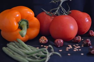
I decided upon a simple vegetable still-life against a plain black background. I put a speed light on a stand and positioned this to the right of the still-life. After a few test shots I decided upon 1/32 flash power. The camera was positioned in front, facing the still-life. As I was shooting under low light (except for the flash) I opted to use a wide aperture.

I gathered the card, foil and the speed light’s diffusion dome and placed these close by. To this assortment I also added a, recently purchased but not yet used, 5 in 1 reflector set.

Exercise

I carried out the exercise instructions (and adding a few steps to incorporate the 5 in 1 reflector) took the following photographs.

1. Without a diffuser on the speed light.

Without a diffuser the light is small and high contrast. This has caused bright highlights on both tomatoes and on the top of the pepper. There is a hard shadow of the pepper on the background cloth and of the pepper and the green beans on the left of the frame where no light has entered the shadow (Hunter et al, 2012, p19). The colour of the tomatoes appears washed out by the white light.

_DSC1899 without diffuser

1. Without diffusor,
68mm, f/4.5, 2s, ISO 250

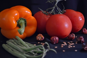
2. With a diffuser on the speed light.

The highlight spots on the vegetables are smaller than previously. The diffuser has made the light larger and scattered it. Some of the light has entered the shadow areas making the shadows softer. (Hunter et al, 2012, p21)

_DSC1900 with diffuser

2. With diffuser,
68mm, f/4.5, 2s, ISO 250

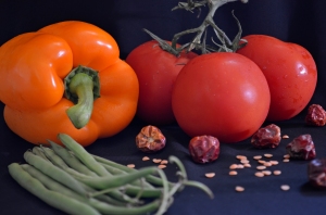
3. With diffuser. White card positioned 3 feet from arrangement, opposite from the lamp.

The white card has reflect some of the light back onto the scene and as a result it has filled the shadow cast by the beans and pepper on the left hand side of the frame.

_DSC1901 white card 1m

3. White card positioned 3 ft from arrangement, opposite lamp.
68mm, f/4.5, 2s, ISO 250

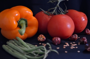
4. With diffuser. White card positioned 1.5 feet from arrangement, opposite from the lamp.

I had difficulty focusing in this image due to low light, therefore I adjusted the composition and exposure slightly. This has made it difficult to directly compare the contrast in this image with the previous one. Although there does look to be slightly more highlighted areas on the fruit.

According to Präkel (2007, p116) reflected light behaves in the same way as a main light source which means it follows the inverse square law. The inverse square law states that the intensity of light observed from a constant source falls off as the square of the distance from the source. (p13). Put simply, by moving the reflector half as close as previous you double its effect, meaning twice as much reflected light.

_DSC1902 white card 1-2m_edited-1

4. White card positioned positioned 1.5 feet from arrangement, opposite from the lamp.
55mm, f/5.6, 1s, ISO 320

5. With diffuser.  White reflector positioned 1.5 feet from arrangement, opposite from the lamp.

There seems to be no real difference in contrast between the white card and white reflector, except perhaps, the white reflector has reflected more light onto the background cloth.

White reflector. 55mm, F/5.6, 1s, ISO 320

White reflector, positioned 1.5 feet from arrangement, opposite from the lamp.
55mm, F/5.6, 1s, ISO 320

6. With diffuser. Gold reflector positioned 1.5 feet from arrangement, opposite from the lamp.

Golf reflector

6. Golf reflector,
55mm, f/5.6, 1s, ISO 320

Gold reflectors work like other reflectors by directing light back onto the subjects, however, gold reflectors ‘warm up’ the reflected light Präkel (2007, p116). The contrast in the image using the gold reflector is similar to the that of the white reflector although on close inspection the contrast is slightly less around the dark areas of the pepper stem and the green beans. The pepper is also very slightly more yellow with the gold reflector.

7. With diffuser. Silver reflector positioned 1.5 ft from arrangement, opposite from the lamp.

The silver reflector seems to have reflected a lot more light onto the scene than the white reflector. The left side of the pepper is lighter and markings can be seen while a new small highlight spot can now be seen reflected in the peppers skin on the far left of the frame.

7. Silver reflector, 55mm, f/5.6, 1s, ISO 320

7. Silver reflector,
55mm, f/5.6, 1s, ISO 320

8.  Card covered with aluminum foil, dull side facing outwards, and take photograph.

The dull sided foil has reflected a lot of light back into the shadows. In particular those on the cloth covering the tabletop and under the pepper on the right side.

Card covered in foil, dull side facing out. 55mm, f/5.6, 1s, ISO 320

Card covered in foil, dull side facing out.
55mm, f/5.6, 1s, ISO 320

9.  Card covered with aluminum foil, shiny side facing outwards, and take photograph.

Unfortunately the focus on the shot was off and I failed to notice this at the time of shooting. I have still included it though as you can see that the shiny side of the foil has filled the shadows underneath the peppers and tomatoes and also in the shadows cast by the dries chillies.

Foil shiny side facing out, 55mm, f/5. 1s, ISO 320

Foil shiny side facing out,
55mm, f/5. 1s, ISO 320

10. Card covered with crushed, then smoothed, aluminum foil with the shiny side facing out. Take photograph.

Rather surprisingly, the crumpled but smoothed foil seemed to reflect the same, if not more, light than the smooth foil. Possibly because the light is being scattered at many different angles?

Crushed then smoothed foil shiny side facing out, 55mm, f/5.6, 1s, ISO 320

Crushed then smoothed foil shiny side facing out,
55mm, f/5.6, 1s, ISO 320

Arranged in order, from highest contrast to lowest.

I am now asked to compare the photographs and arrange then in order of contrast from highest to lowest.

Highest contrast, without diffusor and no reflector.

Highest contrast,
without diffuser and no reflector.

With diffusor

With diffuser

White card at 3ft

White card at 3ft

White card at 3ft

White card at 1.5ft

White reflector.

White reflector.

Golf reflector

Golf reflector

Silver reflector,

Silver reflector

Card covered in foil, dull side facing out.

Card covered in foil, dull side facing out.

Crushed then smoothed foil, shiny side facing out.

Lowest contrast, Crushed then smoothed foil, shiny side facing out.

Foil shiny side facing out,

Lowest contrast, Foil shiny side facing out.

The naked lamp without a diffuser resulted in the highest contrast image. The contrast was then reduced by the use of a diffuser and then various light reflectors which reflected light back onto the scene filling the shadows. In this instance, the foil seemed to do this best because of it’s directly reflective quality.

Conclusions

This exercise has shown me that there are several tools available to help the photographer control contrast to varying degrees. Interestingly, the foil and white card gave similar results to the commercial kit which is good to know for the occasions where I don’t have it on me.

The big decision, it would seem, is for the photographer to decided how much contrast do they want in their scene and therefore how much shadow fill is necessary.

For this particular exercise, the one with the most shadow fill was not necessarily the best option. I preferred the shots with a medium amount of contrast, perhaps with the white card and white reflector.

Conversely, it is good to know that should I wish to increase contrast further at the time of shooting. I can do this by moving a naked lamp further away from the subject or by substituting a reflector for a black piece of card.


Hunter, F., Biver, S. and Fuqua, P., (2012) Light-Science and Magic. (4th ed.) Waltham: Focal Press

Präkel (2009) Exposure. Lausanne: AVA

Präkel, D. (2007) Lighting. Lausanne: AVA

The lighting angle

The lighting angle

Introduction

Präkel (2007, p120) notes that the direction from which light falls on to a subject has a major impact on the viewers ‘reading’ of the image. This exercise will help to illustrate this as we look at the effects of moving the lighting angle. The instructions are as follows-

  • Select a subject. It should be no bigger than the diffuser in front of the light. It should be rounded and have a variety of planes to show areas of light and shadow.
  • Position the subject on a small level surface with a plain background.
  • Fix the camera onto a tripod and aim it at the subject.
  • Fit the light with a diffuser and move it around the subject taking _DSC1893 with the light in front of the camera, from the side, from behind and to one side and from directly behind.
  • Raise the light so that it point to the subject at angle of approximately 45 degrees. Again, move the light around the subject.
  • Suspend the light above the subject, pointed down. Take three pictures: directly overhead, slightly in front and from slightly behind.
  • Study the photographs to note the effect the lighting position has on showing the subject’s shape and form.

I selected a small trinket box as the subject for this exercise as it met the criteria in terms of shape and size. I used a speed light as the light source and placed it on a stand to be triggered wirelessly from my camera. I also closed the curtains in the room to minimise light from sources other than the speed light. As I was working in low light and long exposure times I used a shutter release cable.

Light level with subject

Front

front_edited-1

Front
55mm, f/5.6, 8s, ISO 125

Präkel (2007, p158) notes that when light falls directly flat onto a subject very little texture will be revealed. This can be seen here. The frontal lighting has made the image very low contrast. There are no shaded areas to be seen on the carved box lid making it appear flat and 2-dimensional.

Side

_DSC1810

55mm, f.5.6, 10s, ISO 125

Präkel (2007, p158) advises that side lighting is effective for emphasising texture in an object as the light skims over the surface showing the micro contrasts. Side lighting has done this here by showing areas of shadow and highlight and modelling the subject’s surface.

Behind and to one side

_DSC1810

Behind and to one side
55mm, f/5.6, 8s, ISO 125

There is quite a lot of highlight on the lid surface that contrasts with the areas of shade on the underside of the lid and the left side of the face and arms. The lighting behind and to one side has caused a large shadow to fall around the left side of the box.  Präkel (2007, p157) states that a cast shadow is helpful in revealing form as the shadow anchors a solid object on a plane and enhances the illusion of three dimensions on a two-dimensional page

Behind

silouhette

Behind 1,
55mm, f/4.8, 1/4s, ISO 200, -4 EV

I spent quite some time on this part of the exercise adjusting the flash’s power and experimenting with exposure compensation while attempting to capture a silhouette without clipping any highlights or shadows. I changed the background to white to enable the shape of the subject to be seen.

There are still some details visible in the silhouette, despite my best efforts. I have since read on several photography websites (http://digital-photography-school.com/how-to-photograph-silhouettes and http://photofocus.com/2013/08/09/how-to-photograph-a-silhouette/) that when trying to take a silhouette photograph it is better to expose for the background. So perhaps this is where I was going wrong? However it is clear that back lighting is effective at showing shape, although I quickly realised that the side-on view of the box was not a very distinctive shape and that the shallow depth of field has rendered some of the outline a little fuzzy. I tried this again with a slightly different arrangement to show the oval shape of the box.

58mm, f/4.8, 1/8s, ISO 200

Behind 2, 58mm, f/4.8, 1/8s, ISO 200, -5 EV

This is another photograph of light coming from behind the subject, however this time the camera is not looking towards it. It has created a rim of light around the top edge of the trinket box, which also helps to show its shape.

There also seems to be a pink/orange tone to this image that I wasn’t aware of at the time of shooting.

_DSC1815

Behind 3
55mm, f/5.6, 10s, ISO 125

Out of the four possible lighting scenarios I think Side lighting and Behind 3 gave the best results for this subject. They both gave the subject areas of shadow and highlight which helps give a photograph a 3 dimensional appearance.

Light pointing down at 45 degrees

Front

_DSC1889

This is fairly low contrast with no real areas of dark shadow or bright highlights.

Side

_DSC1891

With the light hitting the subject from the right a few areas of highlight can be seen reflected in the lid. The side lighting helps to emphasis the textures of the carving and it appears more pronounced.

Behind and to one side

_DSC1892

The highlights are brighter here and draw the eye. There is also a shadow on the underside of the figures arms and under the flowers. These help reveal the object’s 3 dimensional quality.

Behind

_DSC1897

The areas of bright reflection have now gone. The areas of shadow are more defined around the head, on the flowers, under the arms and in the box. The front of the box is in shade and this allows the texture and pattern on the box to be seen. Of these four image this is the one I prefer as the shadows have modelled the box well and also the colours seem less yellow and have more of a brown/pink tint.

Light above

Directly overhead

_DSC1893

The light above has resulted in only a little bit of shadow to be seen below the lid. As the lid is sitting at an angle the light above has still provided some shade under the chin, flowers and arms. The front side of the box and left rim of the lid are in shade, which has helped to reveal the texture, which is all but lost in the highlighted areas.

Above, but slightly in front

55mm, f/5.6, 10s, ISO 200

The angle of light has meant that it has managed to fill a lot of the shadows on the lid and make the contrast quite low. The colours appear very pale and the foreground is quite bright.

Above, but slightly behind

The light has shown up a few areas of highlight on the face, shoulders and on the top of the lid. This contrasts with the shadows and helps reveal the form on the lid.

55mm, f.5.6, 10s, ISO 200

I think of these three lighting positions above and slightly behind worked best for this subject as it revealed both highlight and shadow and helped to strengthen the solidity of the object.

Conclusions

This exercise has illustrated that the angle and direction of light have a strong influence on how the end image is viewed and to what degree a subject’s qualities are revealed.

Front lighting did little to show the texture of the trinket box in any of the set ups I used and made the image look quite flat. However I do wonder if this would be the case for all subjects? Perhaps a lighting set up that minimizes texture would be good for portrait work?

Back lighting, comes from behind the subject towards the camera was good for revealing an objects shape, although, as I found out when attempting this, gauging a suitable exposure was difficult.

Side lighting is effective for emphasising texture however if there is a grain to the texture, the light should be used across the grain to show this.

Overall, I think the exercise was valuable in showing some of the creative options available using only one light and varying its position and angles. This can be seen in the thumbnails below.

_DSC1897

silouhette

_DSC1810

_DSC1815

Präkel, D. (2007) Lighting. Lausanne: AVA

http://digital-photography-school.com/how-to-photograph-silhouettes

http://photofocus.com/2013/08/09/how-to-photograph-a-silhouette/